
A few years ago, I approached Bricks projects by looking for a plugin every time I needed an extra feature. An animation add-on solved one problem. A slider add-on solved another. An optimization plugin handled a few WordPress defaults. Before long, a relatively simple website depended on several products with different interfaces, update cycles, and compatibility risks.
I no longer work that way by default.
Bricks has matured, and many things that once required an add-on are now available natively. For the smaller gaps that remain, I increasingly prefer focused code that I understand and can carry from one project to another.
That is why I built NDN Bricks Child: a reusable Bricks child-theme boilerplate containing the practical features I repeatedly need, but not the large feature surface of a general-purpose add-on suite.
The goal is not to compete with full Bricks add-ons. The goal is to make my own project setup faster, more predictable, and easier to maintain.
This article explains how the theme is structured, what every feature does, how the controls appear inside Bricks, and where I deliberately stopped adding complexity.
The short answer: what is NDN Bricks Child?
NDN Bricks Child is a normal WordPress child theme for Bricks with an additional modular feature layer.
It currently groups its features into four areas:
- Animation: lightweight CSS entrance animations and more expressive GSAP presets.
- Elements: enhancements for the native Bricks Slider (Nestable) element.
- Optimization: image processing, WordPress cleanup, revision limits, and Heartbeat control.
- Utilities: local avatars, media helpers, email identity, admin columns, login branding, and dashboard cleanup.
Each module owns its settings, hooks, Bricks controls, and assets. The feature registry is explicit, and frontend files are loaded only when the relevant feature—and, where possible, the relevant element configuration—is actually in use.
This matters because a convenience layer should not quietly become a performance problem of its own.
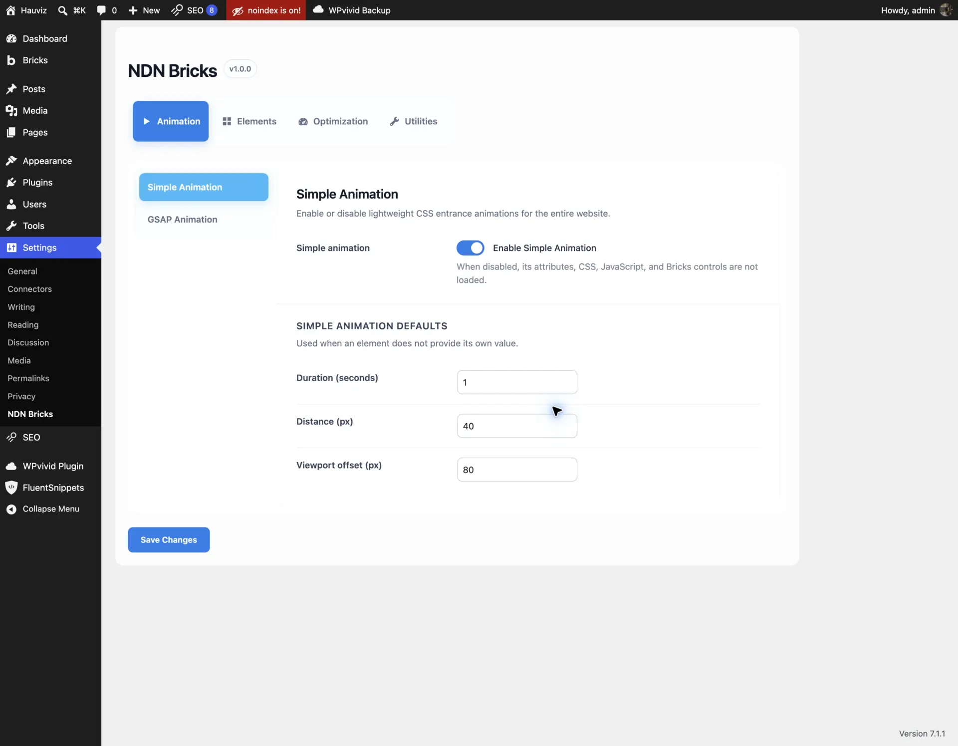
Screenshot 1 — The settings interface uses four primary categories and a secondary feature navigation. The tabs switch without reloading the page, so unsaved changes remain in the shared form.
Why I built it as a child theme instead of another plugin
Some of these features could live in a plugin. A few could also remain as code snippets. I chose a child theme because this package represents how I build Bricks websites rather than a universal WordPress product.
The distinction is useful:
- The parent Bricks theme remains responsible for the builder and its core frontend output.
- The child theme contains my project foundation, integrations, and small behavior extensions.
- Project-specific code can still sit beside the reusable modules without modifying Bricks itself.
- Updating Bricks does not overwrite the custom layer.
I also wanted one place where I could audit the complete feature set. A collection of snippets is fast at first, but it becomes harder to remember which snippets are active, which overlap, and which assets they load.
In this child theme, the feature registry lives in includes/bootstrap.php. A module is not loaded merely because a PHP file happens to exist in the directory. It must be deliberately registered.
The structure is intentionally ordinary:
bricks-child-ndn/
├── functions.php
├── style.css
├── includes/
│   ├── bootstrap.php
│   ├── core/
│   │   └── settings-page.php
│   └── features/
│       ├── entrance-animation.php
│       ├── gsap-animation.php
│       ├── slider-enhancements.php
│       ├── image-optimization.php
│       └── ...
└── assets/
    ├── css/
    ├── js/
    ├── images/
    └── vendor/
Every module follows the same contract:
- Register its settings through the WordPress Settings API.
- Sanitize every saved value.
- Add its own hooks only when the feature is enabled.
- Add Bricks controls only when the feature is available.
- Load frontend assets conditionally.
- Preserve saved settings when temporarily disabled.
The last point is important. Turning a feature off should stop its behavior without destroying the configuration. If I enable it again later, the previous setup is still there.
Installing and configuring the theme
The setup is the same as a normal Bricks child theme:
- Install and activate the Bricks parent theme.
- Copy the
bricks-child-ndnfolder intowp-content/themes/. - Activate NDN Bricks Child from Appearance → Themes.
- Open Settings → NDN Bricks.
- Enable only the modules required for the project.
- Configure global defaults before adding element-level overrides.
The settings screen uses one shared form. The main tabs switch in place rather than loading separate WordPress admin pages. This means I can move between Animation, Elements, Optimization, and Utilities without losing unsaved values. One Save Changes action stores the complete configuration.
I keep destructive or behavior-changing features disabled by default. Image conversion, revision limits, cleanup switches, and most utilities should be conscious project decisions rather than assumptions.
Simple Animation: the everyday entrance system
The first animation module solves a very specific problem: simple entrance effects should be quick to configure and should trigger at a predictable point in the viewport.
Bricks Interactions can handle entrance animation, but large elements can sometimes begin too early because the trigger relates to the element’s viewport intersection. A 600-pixel-tall section may already be well into its transition before the part I care about reaches the intended visual position.
Simple Animation uses a small Intersection Observer runtime and CSS transitions. It provides seven presets:
- Fade
- Up
- Down
- Left
- Right
- Zoom
- Blur
The global settings provide three defaults:
- Duration:
1s - Distance:
40px - Viewport offset:
80px
These values become the project baseline. An element can override them only when needed.
The Bricks controls also provide manual delay and children stagger. Children stagger is applied to a parent, then its animated direct children reveal one after another. This is useful for card grids, navigation lists, and groups of headings without manually calculating a separate delay for every child.
The runtime observes each element independently. It sorts elements that enter during the same observer batch, and it does not use the old generic data-in-view name. All attributes are prefixed to avoid colliding with project scripts.
Screenshot 2 — Simple Animation can be enabled globally, while duration, movement distance, and viewport offset become inheritable defaults.
How I configure Simple Animation in Bricks
- Enable it under Settings → NDN Bricks → Animation → Simple Animation.
- Open an element in Bricks.
- Go to Style → Simple Animation.
- Choose a preset.
- Leave duration, distance, and offset empty to inherit the global configuration.
- Add a manual delay only when the normal sequence needs an exception.
- For a group animation, configure children stagger on the parent.
The feature respects prefers-reduced-motion. Visitors who request reduced motion receive the final state without the transition.
Video 3 — The Animation Demo template provides a visual reference for every lightweight preset instead of forcing the user to guess from a dropdown label.
GSAP Animation: expressive presets without a shared timeline
Simple Animation is enough for most content. GSAP Animation exists for the moments where I want stronger easing, scale, blur, rotation, or reversible playback.
The available presets are:
- Fade
- Fade Up
- Fade Down
- Fade From Left
- Fade From Right
- Zoom In
- Zoom Out
- Blur Up
- Rotate Up
The global defaults include duration, distance, ease, viewport start, and whether the animation plays once. The ease options include short plain-English descriptions such as “Balanced,” “Smooth,” “Dramatic,” and “Overshoot,” which makes the control more approachable for users who do not already speak in GSAP easing names.
Although the animation itself uses GSAP, the viewport trigger is intentionally based on Intersection Observer rather than a shared ScrollTrigger instance. Every animated element owns its observer and tween. This prevents one element from accidentally starting all other animations and avoids shared trigger state when dynamic Bricks content is re-rendered.
GSAP assets are stored locally and version-locked. The module also watches Bricks frontend rendering and DOM changes so newly inserted AJAX or popup content can be initialized without reloading the page.
When an element has both animation systems configured, GSAP takes priority. Running two systems against the same transform, opacity, and filter properties would create unpredictable results.
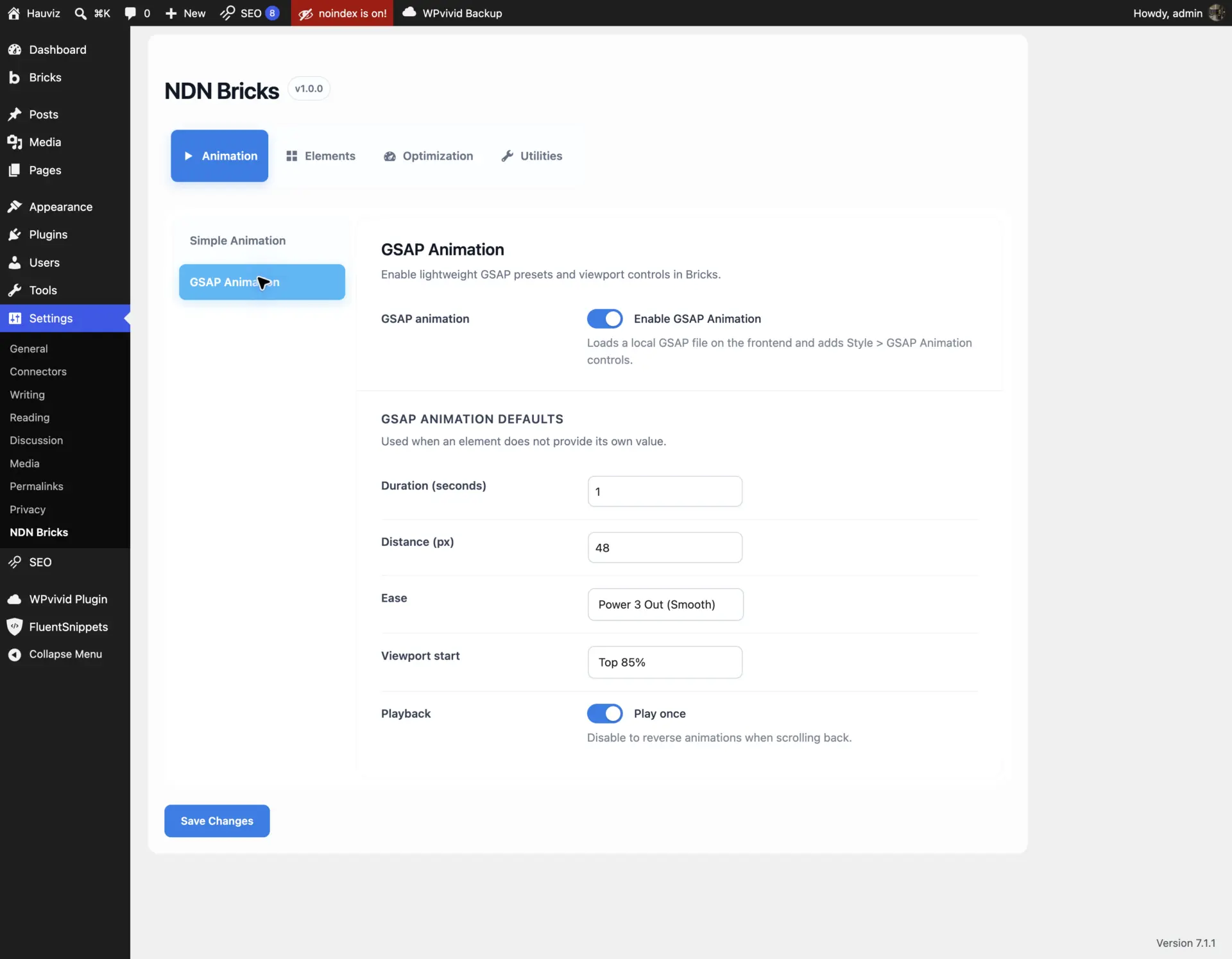
Screenshot 4 — Site-wide GSAP defaults establish a consistent motion language while element values remain optional overrides.
How I configure GSAP Animation in Bricks
- Enable GSAP Animation in the Animation settings.
- Select the element that should animate—not merely a heading inside the card if the entire card should move.
- Open Style → GSAP Animation.
- Choose the preset.
- Set duration, delay, distance, ease, or viewport start only when the element must differ from the global system.
- Leave Play once enabled for normal entrance animation, or disable it when the animation should reverse after scrolling back above the trigger.
- Set Direct children stagger above zero when the parent should sequence its immediate children.
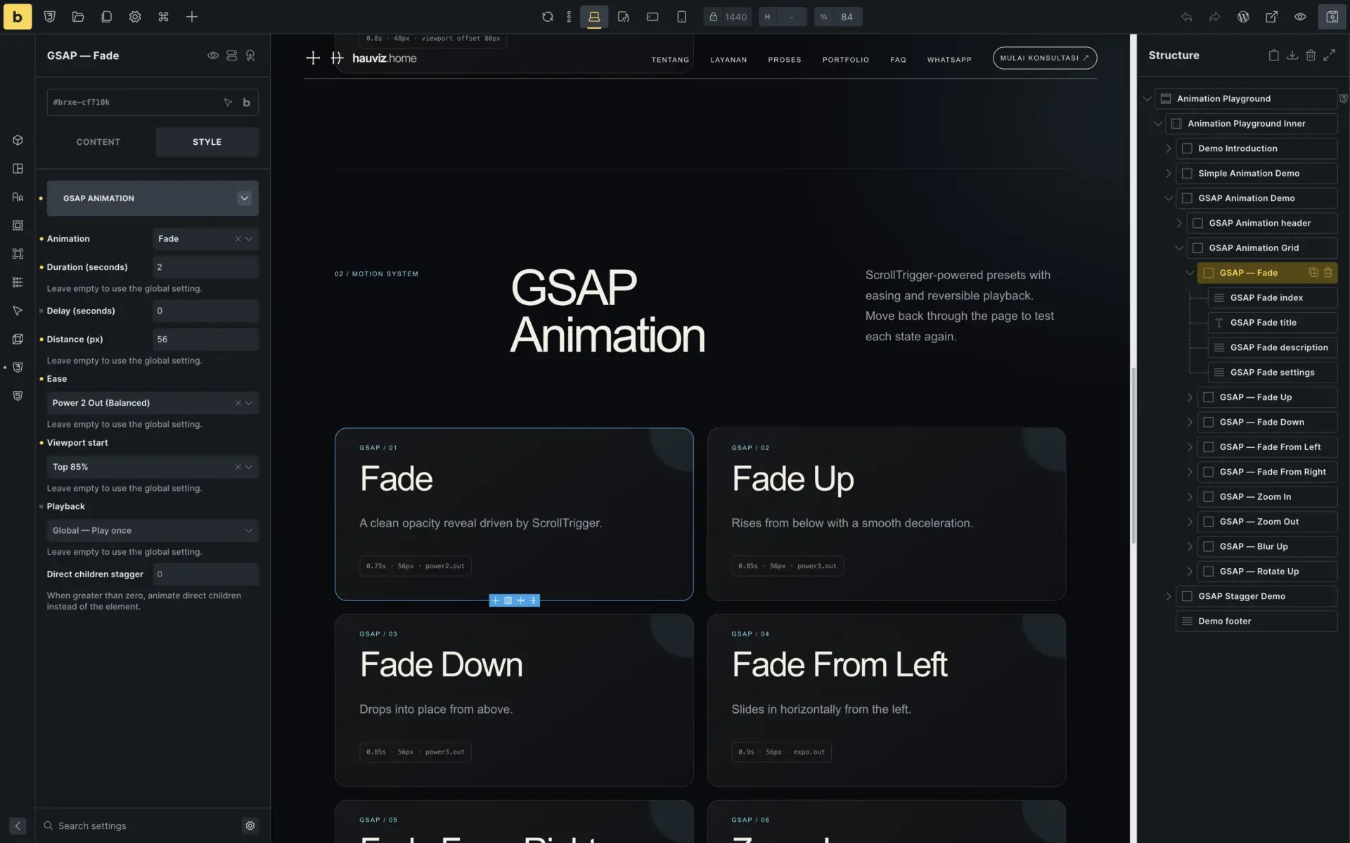
Screenshot 5 — The controls are native to the Bricks Style panel. Element-level values clearly show when they override global defaults.
Video 6 — The frontend demo separates each preset into a repeatable visual test rather than relying only on documentation.
Slider Enhancements: extending the native Nestable Slider
The largest module in the theme extends Bricks Slider (Nestable), which already uses Splide internally.
I like the native element because it keeps slide content fully nestable. The limitation is that Splide exposes capabilities that Bricks does not currently surface. Replacing the element with an entirely separate carousel would throw away the useful native editing experience, so I took a different approach: keep the Bricks element and add an Enhancements control group.
Enabling the module does not change existing sliders. A slider only receives additional behavior after that behavior is configured on the individual element.
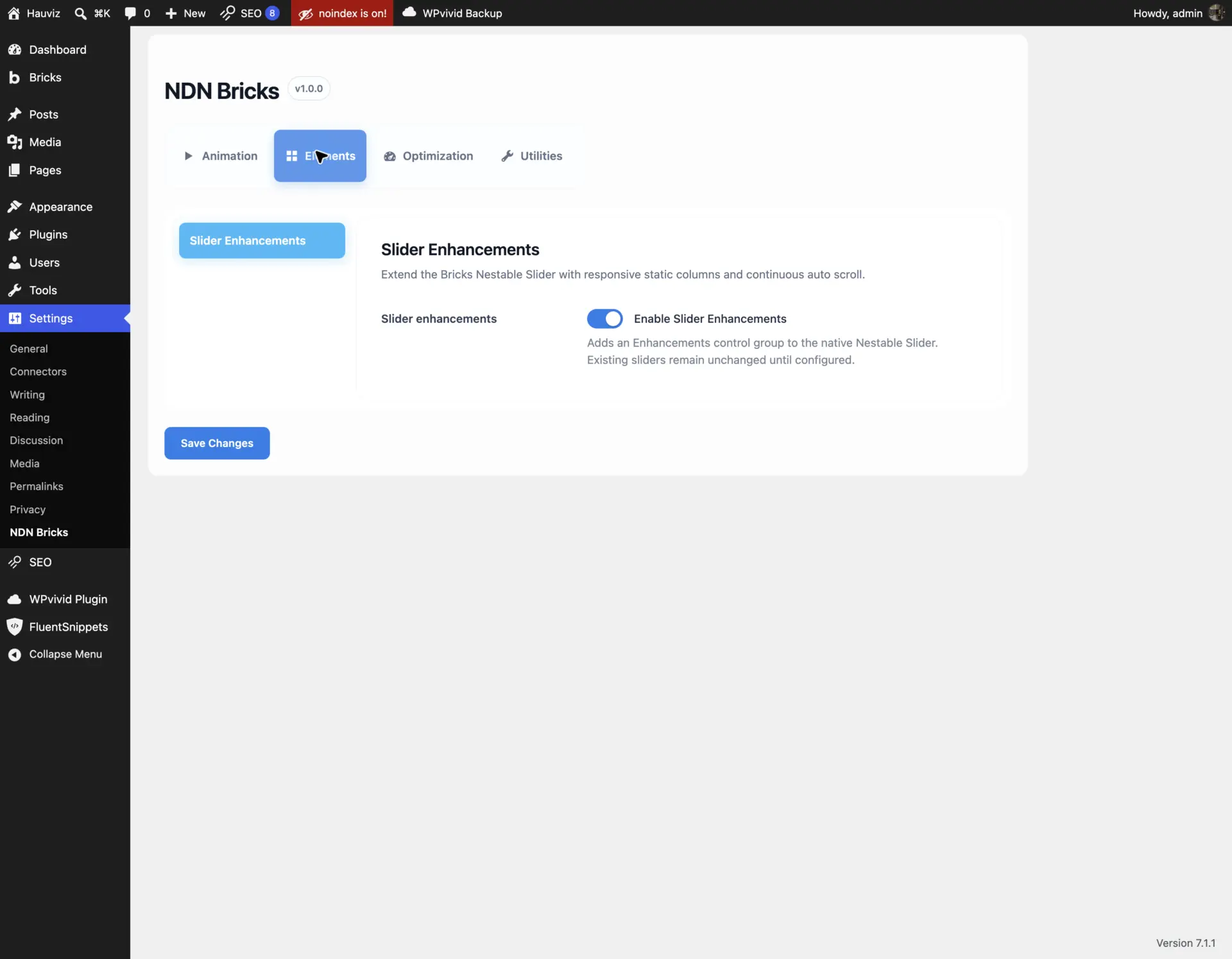
Screenshot 7 — The global setting only makes the Bricks controls available. Existing sliders remain unchanged until configured.
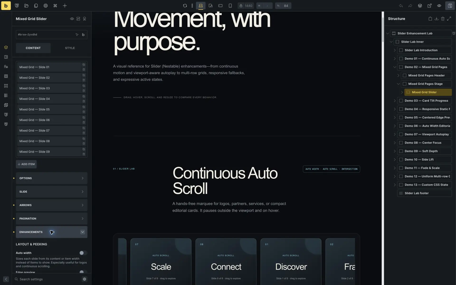
Screenshot 8 — The native Nestable Slider keeps its familiar editing workflow and adds one organized Enhancements panel. The remaining controls continue below the visible Layout & Peeking group.
Auto Width
Auto Width lets every slide use its intrinsic width instead of being forced into an items-per-page grid. It works well for logo strips, editorial cards with varied widths, tags, or continuous marquees.
An optional default item width can standardize the cards. When left empty, the width can come from each slide’s own Bricks styles. While Auto Width is active, Splide intentionally ignores the normal Items to show value.
Edge Preview
Edge Preview uses Splide’s track padding to reveal part of the previous or next slide. It supports independent left, right, top, and bottom values through a native Bricks spacing control.
For a conventional horizontal carousel:
- Use Center alignment to reveal neighbors on both sides.
- Use Start alignment to keep the active slide at the beginning and preview the upcoming content.
The implementation disables trim space so the visual padding is preserved at the first and final slide.
Responsive Static Fallback
Sometimes the best desktop slider is no slider at all.
The Disable slider at control destroys Splide at a selected Bricks breakpoint and above. The slides then become a normal static layout. Column count and spacing still come from Bricks’ native Slides per page and Gap settings.
The breakpoint list is not hard-coded. It reads the actual Bricks configuration, including custom breakpoints. This allows the same child theme to follow each project’s responsive system.
Inside the builder, the module keeps the native slider mounted to protect editing and drag-and-drop. A static grid preview mirrors the frontend layout without destabilizing the canvas.
Continuous Auto Scroll
Continuous Auto Scroll creates marquee-like motion for logos, partners, services, and compact cards. It uses the locally bundled official Splide Auto Scroll extension.
Controls include:
- Speed
- Direction
- Pause on hover
- Pause on focus
Native autoplay is disabled for that slider because two movement systems should not compete. Motion also pauses when the visitor requests reduced motion.
Intersection Control
The official Splide Intersection extension pauses autoplay or continuous scrolling when the slider is outside the viewport and resumes it when the configured visibility threshold is reached.
The controls include:
- Visible amount
- Viewport margin
- Keyboard only in view
- Observe once
This is especially useful for a slider far down the page. It should not finish its animation sequence before the visitor reaches it, and an off-screen marquee should not consume animation work indefinitely.
Progress Bar
The Progress Bar supports two modes:
- Autoplay Timer: fills during the current autoplay interval.
- Slider Position: represents progress from the first to the final slide.
When Intersection pauses autoplay, the timer pauses as well. The optional preserve setting retains elapsed progress across intersection, hover, and focus pauses. Continuous Auto Scroll automatically uses position mode because continuous movement has no finite per-slide interval.
Height, colors, radius, and top or bottom placement are configurable per slider.
Update on Move and transition presets
Splide normally updates state classes at the end of movement. Enabling Update on move keeps is-active, is-prev, and is-next current during the transition.
The module includes several visual presets:
- Center Focus
- Soft Depth
- Side Lift
- Fade & Scale
- Card Tilt
- Classes Only
Classes Only is the escape hatch. It enables the useful Splide states without forcing a theme style. The Custom CSS field accepts selector, {{WRAPPER}}, or %root% as the current slider root, keeping the rules scoped to that element.
For a centered highlighted card, I set the native Splide Focus option to center. For a left-aligned carousel, I use 0. The optional effect space adds room inside the clipped track so scale, shadow, lift, and rotation are not cut off.
Multi-row Grid
The Grid feature uses the locally bundled official Splide Grid extension. It supports two models:
- Uniform Grid: repeats one rows-by-columns pattern.
- Custom Layout: uses a sortable repeater where each carousel page defines its own rows and columns.
A custom sequence can be 2×2 → 1×1 → 2×1. After the final definition, Splide repeats the final pattern for any remaining slides.
The Grid controls support Bricks responsive breakpoints. Grid mode can be disabled at a breakpoint while the normal one-row slider remains active. Auto Width is ignored while Grid is active because the two layout systems are not compatible.
Mixed Grid pages also share the same overall track height. A 1×1 page therefore fills the complete slider height as a portrait feature card, while a 2×2 page divides the available height into two proportional rows.
Video 9 — The Slider Demo template contains working examples for Auto Width, Auto Scroll, Intersection, custom Grid pages, static fallback, edge preview, progress, transition presets, and custom state CSS.
Image Optimization for new uploads
The Image Optimization module processes new JPEG, PNG, and GIF uploads before WordPress generates attachment sizes.
It performs two related jobs:
- Convert supported images to WebP.
- Scale oversized images proportionally to the configured maximum width and height.
The default limit is 1920 × 1920 pixels. A 2560 × 1440 upload becomes 1920 × 1080, preserving its aspect ratio. Either dimension can be set to 0 when that specific limit should be disabled.
The module does not retroactively process the Media Library. It also permanently replaces the new upload file, which is why the feature is disabled by default.
I do not enable this beside another upload-conversion snippet or image plugin. Two processors competing for the same upload creates unnecessary work and makes failures harder to diagnose.
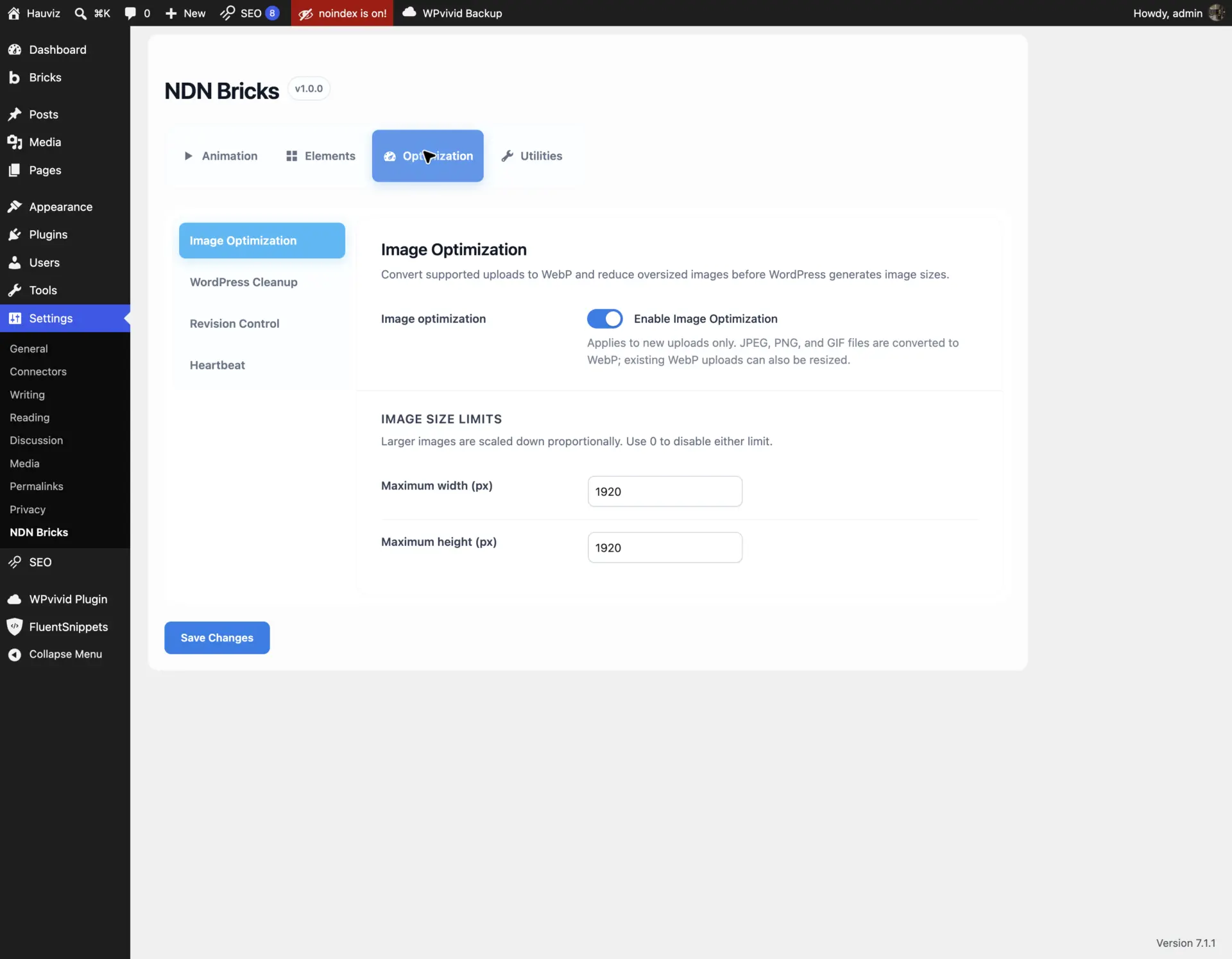
Screenshot 10 — Conversion and resizing are one upload pipeline, with explicit maximum dimensions and a clear new-uploads-only boundary.
WordPress Cleanup without an all-or-nothing switch
Cleanup features are easy to overdo. Removing a WordPress feature may save a request or simplify the dashboard, but it can also break an integration that depends on it.
For that reason, every cleanup item has its own toggle:
- Disable RSS and comment feeds
- Disable comments and pings
- Limit frontend search to posts
- Remove emoji scripts and styles
- Clean generator, RSD, Windows Live Writer, and shortlink metadata
- Disable XML-RPC
- Remove REST discovery headers without disabling the REST API
- Disable the embed script
- Remove block styles outside single blog posts
- Hide the admin footer credit
- Remove the WordPress toolbar logo
- Hide the frontend admin bar for logged-in users
The settings describe the risk where it matters. XML-RPC may affect Jetpack, mobile applications, and remote publishing. Removing block styles can affect Gutenberg or WooCommerce blocks outside blog posts. These are not “always safe” optimizations.
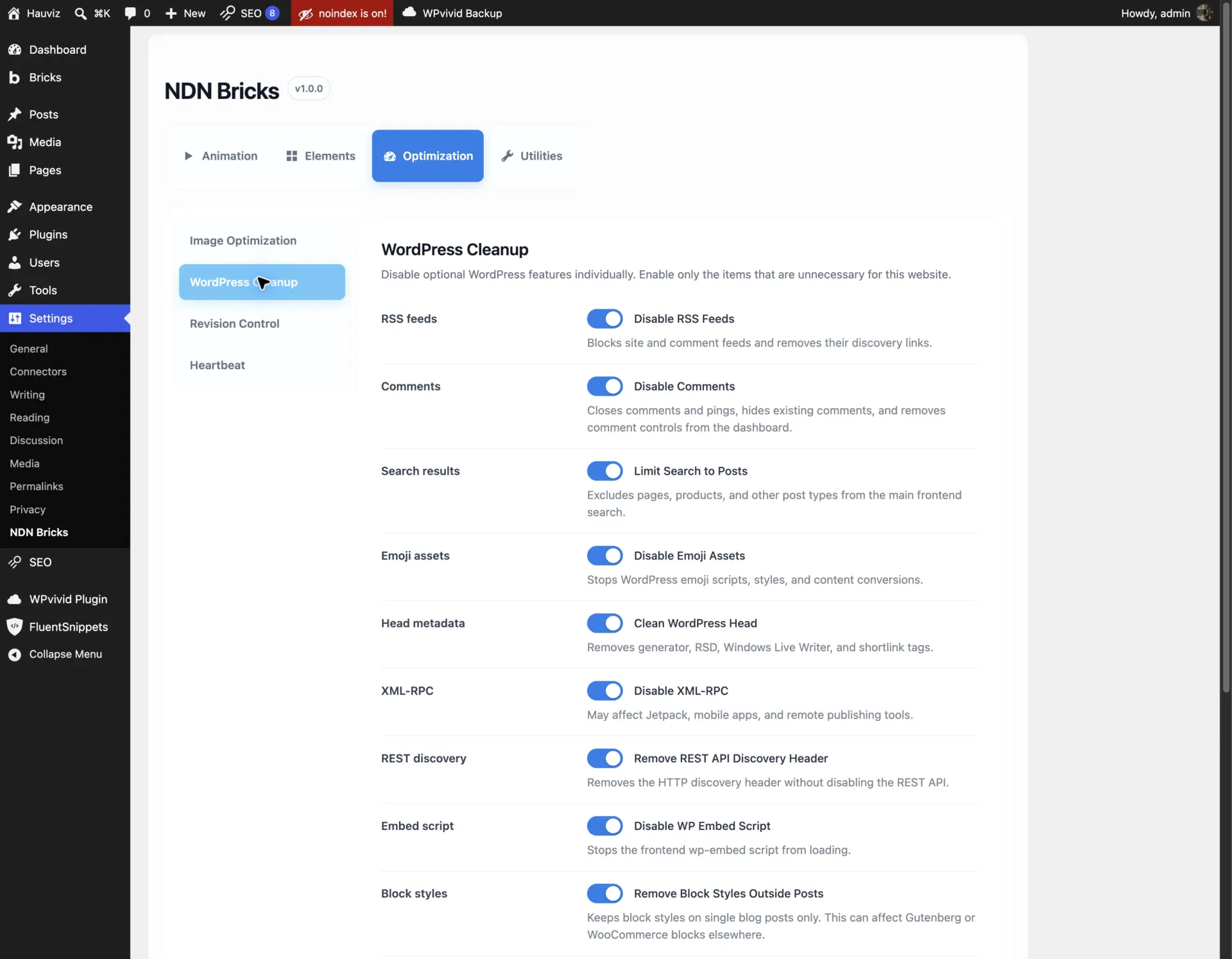
Screenshot 11 — Cleanup is granular. A project can remove only the WordPress features it genuinely does not use.
Revision Control and Heartbeat
Revision Control limits future revision retention without immediately deleting existing history. The default limit is ten revisions for posts and pages.
The broader scope includes every post type that supports revisions, which can include Bricks templates and plugin content. A value of zero disables revisions for the selected scope, so I use it carefully.
Heartbeat Control offers four choices:
- WordPress default
- Every 30 seconds
- Every 60 seconds
- Disable on the frontend only
It never disables Heartbeat inside wp-admin or editors. Autosave, session checks, and post locking are more valuable than the small saving produced by completely removing Heartbeat from the editing environment.
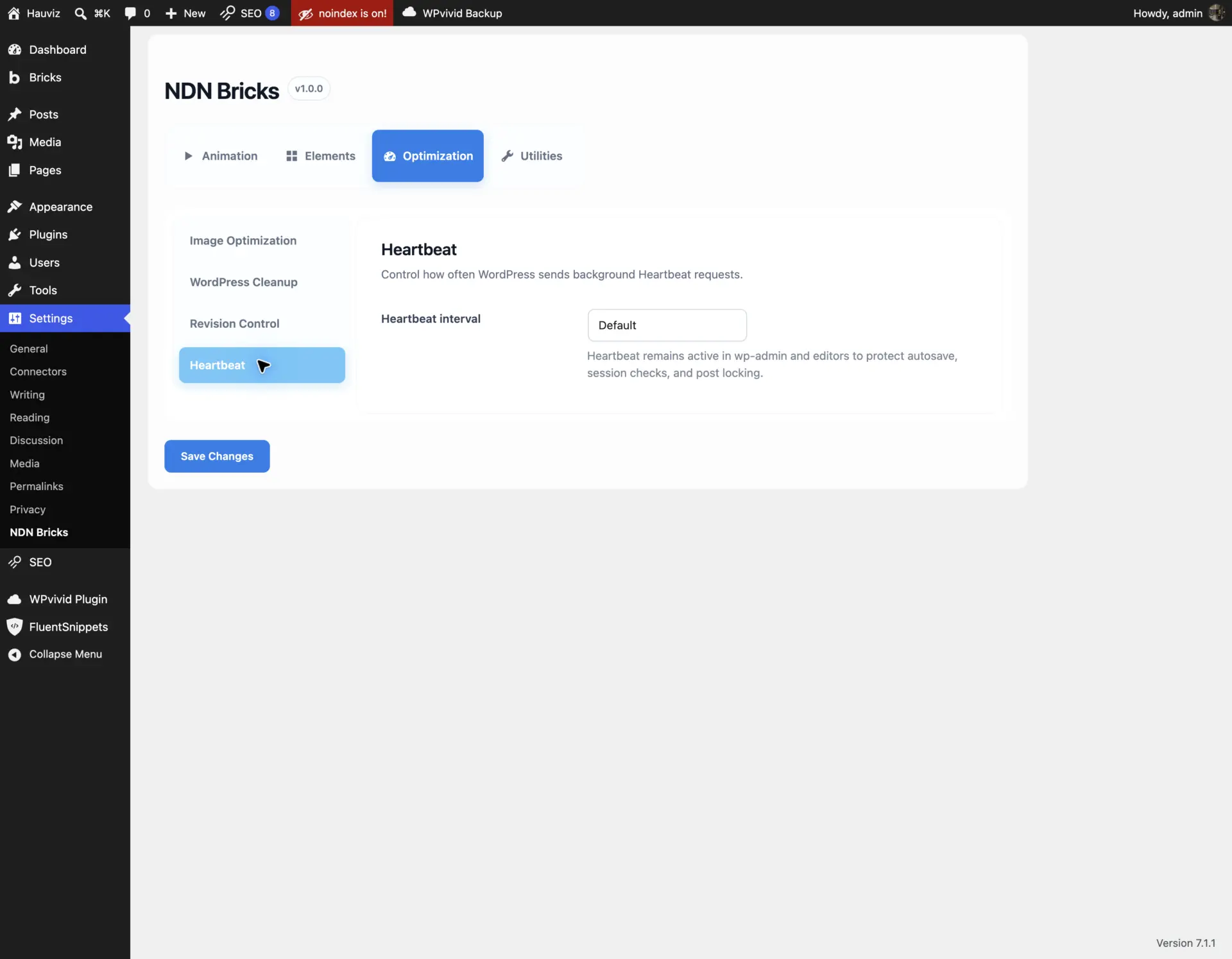
Screenshot 12 — The conservative Heartbeat options reduce unnecessary frontend activity without risking editor autosave and locking.
Local Avatar and Gravatar control
The Local Avatar module adds a Media Library picker to WordPress user profiles. It keeps the standard get_avatar() and get_avatar_url() APIs, so Bricks author boxes, comments, and compatible plugins continue to work normally.
The project can also disable external Gravatar requests. When a user has no custom image, the theme uses a selected local fallback or its bundled default avatar.
This is useful for branded client dashboards, privacy-conscious websites, and projects where authors should not need a separate Gravatar account.
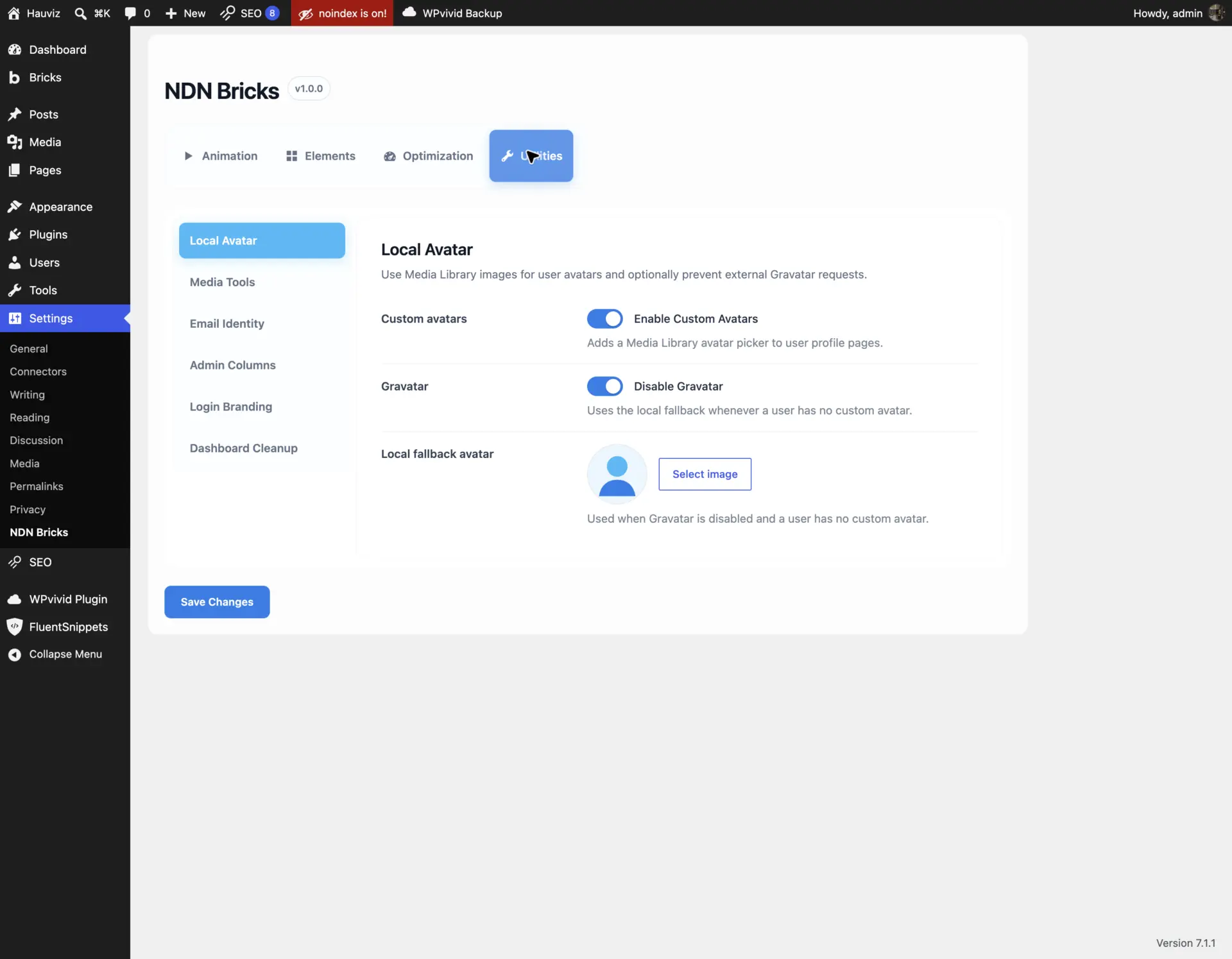
Screenshot 13 — Custom avatars and external Gravatar requests are separate decisions, with an optional local fallback.
Media Tools
Media Tools contains two small upload helpers:
- Auto-fill Image ALT: creates readable ALT text from a filename only when the upload has no ALT text.
- Clean Upload Filenames: converts new filenames to lowercase, hyphen-separated, URL-friendly values and removes unsupported characters.
Neither feature modifies existing Media Library items, and the ALT helper never overwrites manually entered text.
Filename-derived ALT text is only a fallback. Meaningful editorial images still need context-aware alternative text. The feature is most useful for preventing completely empty metadata during routine uploads, not for replacing an accessibility review.
Email Identity
Email Identity sets an optional sender name and sender email for messages sent through wp_mail().
It does not configure SMTP, authenticate a domain, or guarantee delivery. Its job is only to establish a consistent identity. Empty values preserve whatever WordPress or another plugin already provides.
The sender address should still be authorized by the actual email provider.
Admin Columns
Admin Columns exposes small technical details that are repeatedly useful during development:
- Content IDs for posts, pages, Bricks templates, and Media Library list view.
- Original image dimensions for image attachments.
The module loads no frontend assets. It simply removes the need to open an item or inspect its URL whenever I need an ID or image size.
Login Branding
Login Branding applies a custom logo, background color, and accent color to the WordPress login screen. The logo URL points to the website homepage, and its accessible label uses the site title.
It changes presentation only. Authentication behavior remains untouched.
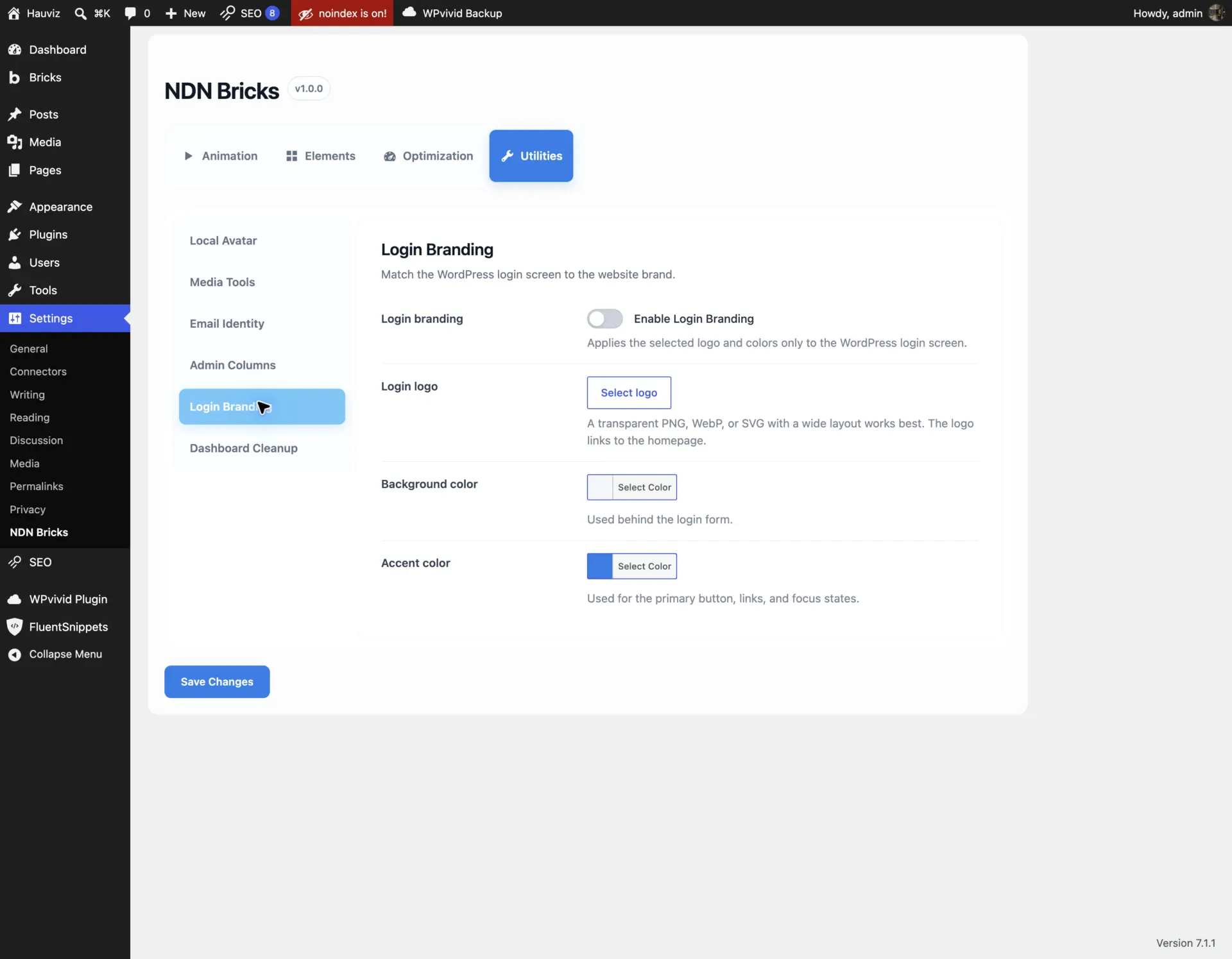
Screenshot 14 — Login branding is deliberately small: logo, background, accent, and a homepage link without modifying authentication.
Dashboard Cleanup
Dashboard Cleanup can independently hide:
- Welcome panel
- Site Health Status widget
- At a Glance
- Activity
- Quick Draft
- WordPress Events and News
Plugin and custom widgets remain untouched. This gives client dashboards a quieter default view without making assumptions about widgets added by the project itself.
What loads on the frontend?
Conditional loading is one of the most important parts of the theme.
Disabling Simple Animation removes its Bricks controls, data attributes, CSS, and JavaScript. GSAP is not loaded when its module is disabled. Slider vendor extensions are requested only when a configured slider needs them.
Within Slider Enhancements:
- Auto Width and Edge Preview use native Splide options and do not need a separate runtime.
- Responsive Fallback, Progress Bar, and Custom CSS have independent scripts.
- Grid, Intersection, and Auto Scroll share one extension manager so they mount in one Splide lifecycle.
- The corresponding vendor file is loaded only when that extension is present on the page.
- Admin-only utilities do not enqueue frontend assets.
This is more work than globally enqueueing one large bundle, but it keeps the feature system aligned with the reason I built it: small conveniences should remain small.
What this theme deliberately does not do
NDN Bricks Child is not intended to replace every animation library, slider builder, optimization suite, or administration plugin.
I deliberately keep several boundaries:
- Complex GSAP timelines remain project-specific JavaScript.
- The animation modules focus on entrance effects, not general interaction design.
- Image optimization handles new uploads, not bulk regeneration or advanced delivery.
- Email Identity is not an SMTP solution.
- Dashboard cleanup does not attempt to manage third-party widgets.
- Slider Enhancements extends Bricks’ Splide implementation instead of becoming a separate carousel system.
These boundaries keep the code understandable. A feature that grows into a product-sized problem should probably become its own plugin—or use an established specialist product.
My deployment checklist
Before moving the child theme into a client project, I check the following:
- Confirm the installed Bricks version and test the builder controls.
- Enable only the required modules.
- Disable overlapping snippets and plugins.
- Establish global animation defaults before styling individual elements.
- Test reduced-motion behavior.
- Verify custom and default Bricks breakpoints.
- Test Slider Enhancements in both the builder canvas and frontend.
- Verify autoplay, Intersection, hover, and focus combinations.
- Upload a test image and confirm its dimensions, format, metadata, and generated sizes.
- Test Gutenberg or WooCommerce layouts before removing block styles.
- Send a real test email through the project’s delivery provider.
- Check the login screen, user avatars, Media Library, and dashboard at the intended user roles.
- Clear caches and verify the final asset requests.
What I learned from building it
The most useful result is not any single feature. It is the foundation.
A consistent settings architecture makes the next small feature easier to add without creating another isolated snippet. An explicit module registry makes the active system easier to audit. Shared conventions make AI-assisted development safer because a new module has a clear place, prefix, lifecycle, and acceptance criteria.
This follows the same principle I use in AI-assisted Bricks migrations: the model can help implement and repeat the work, but the quality comes from the system around it. The architecture, boundaries, examples, testing rules, and final decisions still require deliberate human judgment.
NDN Bricks Child is still evolving. I expect some features to become unnecessary as Bricks adds native capabilities. When that happens, I would rather remove my implementation than maintain a duplicate forever.
That is the real advantage of owning a small, modular layer: I can add what a project needs, remove what the platform has solved, and understand the path between the two.
Technical references
- Bricks Builder
- GSAP
- Splide
- Splide Auto Scroll extension
- Splide Grid extension
- Splide Intersection extension
- WordPress Settings API
- WordPress Theme Handbook: Child Themes
Any questions or want to discuss this further?
If you are building a Bricks website and want to discuss a leaner project foundation, a custom Bricks integration, or an AI-assisted workflow, get in touch with me.